GUIコントロールタイプは、Gui.AddメソッドでGUIウィンドウに追加することができるインタラクションの要素です。
MSIEブラウザコントロールなどのActiveXコンポーネントは、次のようにGUIウィンドウに埋め込むことができます。以下で使用される ActiveXコンポーネントとそのメソッドの詳細については、WebBrowserオブジェクト(Microsoft Docs)およびNavigateメソッド (Microsoft Docs)を参照してください。
MyGui := Gui()
WB := MyGui.Add("ActiveX", "w980 h640", "Shell.Explorer").Value  ; 最後のパラメータは、ActiveXコンポーネントの名前です。
WB.Navigate("https://www.autohotkey.com/docs/")  ; これはウェブブラウザコントロールに特有のものです。
MyGui.Show()
When the control is created, the ActiveX object can be retrieved via GuiControl.Value.
To handle events exposed by the object, use ComObjConnect as follows. For details about the event used below, see NavigateComplete2 event (Microsoft Docs).
MyGui := Gui()
URL := MyGui.Add("Edit", "w930 r1", "https://www.autohotkey.com/docs/")
MyGui.Add("Button", "x+6 yp w44 Default", "Go").OnEvent("Click", ButtonGo)
WB := MyGui.Add("ActiveX", "xm w980 h640", "Shell.Explorer").Value
ComObjConnect(WB, WB_events)  ; WBのイベントをWB_eventsクラスオブジェクトに接続します。
MyGui.Show()
; Continue on to load the initial page:
ButtonGo()

ButtonGo(*) {
    WB.Navigate(URL.Value)
}

class WB_events {
    static NavigateComplete2(wb, &NewURL, *) {
        URL.Value := NewURL  ; URLエディットコントロールをアップデートします。
    }
}
ComObjTypeは、取得したオブジェクトのタイプを決定するために使います。
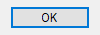
A pushbutton, which can be pressed to trigger an action. In this case, the last parameter is the name of the button (shown on the button itself), which may include linefeeds (`n) to start new lines.
事例:
MyBtn := MyGui.Add("Button", "Default w80", "OK")
MyBtn.OnEvent("Click", MyBtn_Click)  ; クリックされたときにMyBtn_Clickをコールします。
Or:
MyBtn := MyGui.AddButton("Default w80", "OK")
MyBtn.OnEvent("Click", MyBtn_Click)  ; クリックされたときにMyBtn_Clickをコールします。
アピアランス(外観):
Whenever the user clicks the button or presses Space or Enter while it has the focus, the Click event is raised.
The DoubleClick, Focus and LoseFocus events are also supported. As these events are only raised if the control has the BS_NOTIFY (0x4000) style, it is added automatically by OnEvent.
The example above includes the word Default in its Options to make "OK" the default button. The default button's Click event is automatically triggered whenever the user presses Enter, except when the keyboard focus is on a different button or a multi-line edit control having the WantReturn style. To later change the default button to another button, follow this example, which makes the Cancel button become the default: MyGui["Cancel"].Opt("+Default"). To later change the window to have no default button, follow this example: MyGui["OK"].Opt("-Default").
An ampersand (&) may be used in the button name to underline one of its letters. 事例:
MyGui.Add("Button",, "&Pause")
In the example above, the letter P will be underlined, which allows the user to press Alt+P as shortcut key. To display a literal ampersand, specify two consecutive ampersands (&&).
Known limitation: Certain desktop themes might not display a button's text properly. If this occurs, try including -Wrap (minus Wrap) in the control's options. However, this also prevents having more than one line of text.
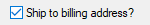
A small box that can be checked or unchecked to represent On/Off, Yes/No, etc.
事例:
MyGui.Add("CheckBox", "vShipToBillingAddress", "Ship to billing address?")
Or:
MyGui.AddCheckBox("vShipToBillingAddress", "Ship to billing address?")
アピアランス(外観):
For the last parameter, specify the label to display to the right of the box. This label is typically used as a prompt or description, and it may include linefeeds (`n) to start new lines. If a width (W) is specified in Options but no rows (R) or height (H), the control's text will be word-wrapped as needed, and the control's height will be set automatically.
GuiControl.Value returns the number 1 for checked, 0 for unchecked, and -1 for gray/indeterminate.
Specify the word Check3 in Options to enable a third "indeterminate" state that displays a gray checkmark or a square instead of a black checkmark (the indeterminate state indicates that the checkbox is neither checked nor unchecked). Specify the word Checked or CheckedGray in Options to have the checkbox start off checked or indeterminate, respectively. The word Checked may optionally be followed immediately by a 0, 1, or -1 to indicate the starting state. In other words, "Checked" and "Checked" VarContainingOne are the same.
Whenever the checkbox is clicked, it automatically cycles between its two or three possible states, and then raises the Click event, allowing the script to immediately respond to the user's input.
The DoubleClick, Focus and LoseFocus events are also supported. As these events are only raised if the control has the BS_NOTIFY (0x4000) style, it is added automatically by OnEvent. This style is not applied by default as it prevents rapid clicks from changing the state of the checkmark (such as if the user clicks twice to toggle from unchecked to checked and then to indeterminate).
Known limitation: Certain desktop themes might not display a checkbox's text properly. If this occurs, try including -Wrap (minus Wrap) in the control's options. However, this also prevents having more than one line of text.
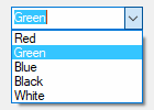
Same as DropDownList but also permits free-form text to be entered as an alternative to picking an item from the list. In this case, the last parameter of Gui.Add is an Array like ["Choice1", "Choice2", "Choice3"].
事例:
MyGui.Add("ComboBox", "vColorChoice", ["Red", "Green", "Blue", "Black", "White"])
Or:
MyGui.AddComboBox("vColorChoice", ["Red", "Green", "Blue", "Black", "White"])
アピアランス(外観):
In addition to allowing all the same options as DropDownList, the word Limit may be included in Options to restrict the user's input to the visible width of the ComboBox's edit field. Also, the word Simple may be specified to make the ComboBox behave as though it is an Edit field with a ListBox beneath it.
GuiControl.Value returns the position number of the currently selected item (the first item is 1, the second is 2, etc.) or 0 if the control contains text which does not match a list item, while GuiControl.Text returns the contents of the ComboBox's edit field. Gui.Submit stores the text, unless the word AltSubmit is in the control's Options and the text matches a list item, in which case it stores the position number of the item.
Whenever the user selects a new item or changes the control's text, the Change event is raised. The Focus and LoseFocus events are also supported.
Other controls which are not directly supported by AutoHotkey can be also embedded into a GUI window. In order to do so, include in Options the word Class followed by the Win32 class name of the desired control. 例:
MyGui.Add("Custom", "ClassComboBoxEx32")  ; コントロールにComboBoxEx を追加します。
MyGui.Add("Custom", "ClassScintilla")  ; Adds a Scintilla control. Note that the SciLexer.dll library must be loaded before the control can be added.
AutoHotkey uses the standard Windows control text routines when text is to be retrieved/replaced in the control via Gui.Add or GuiControl.Value.
Events: Since the meaning of each notification code depends on the control which sent it, OnEvent is not supported for Custom controls. However, if the control sends notifications in the form of a WM_NOTIFY or WM_COMMAND message, the script can use OnNotify or OnCommand to detect them.
Here is an example that shows how to add and use an IP address control:
MyGui := Gui()
IP := MyGui.Add("Custom", "ClassSysIPAddress32 r1 w150")
IP.OnCommand(0x300, IP_EditChange)  ; 0x300 = EN_CHANGE
IP.OnNotify(-860, IP_FieldChange)  ; -860 = IPN_FIELDCHANGED
IPText := MyGui.Add("Text", "wp")
IPField := MyGui.Add("Text", "wp y+m")
MyGui.Add("Button", "Default", "OK").OnEvent("Click", OK_Click)
MyGui.Show()

IPCtrlSetAddress(IP, SysGetIPAddresses()[1])

OK_Click(*)
{
    MyGui.Hide()
    MsgBox("You chose " IPCtrlGetAddress(IP))
    ExitApp()
}

IP_EditChange(*)
{
    IPText.Text := "New text: " IP.Text
}

IP_FieldChange(thisCtrl, NMIPAddress)
{
    ; Extract info from the NMIPAddress structure.
    iField := NumGet(NMIPAddress, 3*A_PtrSize + 0, "int")
    iValue := NumGet(NMIPAddress, 3*A_PtrSize + 4, "int")
    if (iValue >= 0)
        IPField.Text := "Field #" iField " modified: " iValue
    else
        IPField.Text := "Field #" iField " left empty"
}

IPCtrlSetAddress(GuiCtrl, IPAddress)
{
    static WM_USER := 0x0400
    static IPM_SETADDRESS := WM_USER + 101

    ; Pack the IP address into a 32-bit word for use with SendMessage.
    IPAddrWord := 0
    Loop Parse IPAddress, "."
        IPAddrWord := (IPAddrWord * 256) + A_LoopField
    SendMessage(IPM_SETADDRESS, 0, IPAddrWord, GuiCtrl)
}

IPCtrlGetAddress(GuiCtrl)
{
    static WM_USER := 0x0400
    static IPM_GETADDRESS := WM_USER + 102

    AddrWord := Buffer(4)
    SendMessage(IPM_GETADDRESS, 0, AddrWord, GuiCtrl)
    IPPart := []
    Loop 4
        IPPart.Push(NumGet(AddrWord, 4 - A_Index, "UChar"))
    return IPPart[1] "." IPPart[2] "." IPPart[3] "." IPPart[4]
}
A box that looks like a single-line edit control but instead accepts a date and/or time. A drop-down calendar is also provided.
事例:
MyGui.Add("DateTime", "vMyDateTime", "LongDate")
Or:
MyGui.AddDateTime("vMyDateTime", "LongDate")
アピアランス(外観):
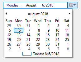
The last parameter is a format string, as described in the SetFormat method below. This method allows to change the display format after the DateTime control is created.
DateTime コントロールの表示形式を設定します。
GuiCtrl.SetFormat(Format)
型:文字列
空白または省略された場合、デフォルトでShortDateになります。Otherwise, specify one of the following formats:
ShortDate: Uses the locale's short date format. For example, in some locales it would look like: 6/1/2005
LongDate: Uses the locale's long date format. For example, in some locales it would look like: Wednesday, June 01, 2005
Time: Shows only the time using the locale's time format. Although the date is not shown, it is still present in the control and will be retrieved along with the time in the YYYYMMDDHH24MISS format. For example, in some locales it would look like: 9:37:45 PM
(custom format): Specify any combination of date and time formats. For example, "M/d/yy HH:mm" would look like 6/1/05 21:37. Similarly, "dddd MMMM d, yyyy hh:mm:ss tt" would look like Wednesday June 1, 2005 09:37:45 PM. Letters and numbers to be displayed literally should be enclosed in single quotes as in this example: "'Date:' MM/dd/yy 'Time:' hh:mm:ss tt". By contrast, non-alphanumeric characters such as spaces, tabs, slashes, colons, commas, and other punctuation do not need to be enclosed in single quotes. ただし、シングルクォート文字そのものは例外です:を文字通りに表示するには、4つの連続した単一引用符(''')を使用します(引用符がすでに外側の引用符のペアの中にある場合は2つだけ)。
To have a date other than today pre-selected, include in Options the word Choose followed immediately by a date in YYYYMMDD format. For example, Choose20050531 would pre-select May 31, 2005 (as with other options, it can also be a variable such as "Choose" Var). To have no date/time selected, specify ChooseNone. ChooseNone also creates a checkbox inside the control that is unchecked whenever the control has no date. Whenever the control has no date, Gui.Submit or GuiControl.Value will retrieve a blank value (empty string).
The time of day may optionally be present. However, it must always be preceded by a date when going into or coming out of the control. The format of the time portion is HH24MISS (hours, minutes, seconds), where HH24 is expressed in 24-hour format; for example, 09 is 9am and 21 is 9pm. Thus, a complete date-time string would have the format YYYYMMDDHH24MISS.
When specifying dates in the YYYYMMDDHH24MISS format, only the leading part needs to be present. Any remaining element that has been omitted will be supplied with the following default values: MM with month 01, DD with day 01, HH24 with hour 00, MI with minute 00 and SS with second 00.
Within the drop-down calendar, the today-string at the bottom can be clicked to select today's date. In addition, the year and month name are clickable and allow easy navigation to a new month or year.
When Gui.Submit or GuiControl.Value is used, the return value is the selected date and time in YYYYMMDDHH24MISS format. Both the date and the time are present regardless of whether they were actually visible in the control.
Whenever the user changes the date or time, the Change event is raised. The Focus and LoseFocus events are also supported.
Choose: See above.
Range: Restricts how far back or forward in time the selected date can be. After the word Range, specify the minimum and maximum dates in YYYYMMDD format (with a dash between them). For example, Range20050101-20050615 would restrict the date to the first 5.5 months of 2005. Either the minimum or maximum may be omitted to leave the control unrestricted in that direction. For example, Range20010101 would prevent a date prior to 2001 from being selected and Range-20091231 (leading dash) would prevent a date later than 2009 from being selected. Without the Range option, any date between the years 1601 and 9999 can be selected. The time of day cannot be restricted.
Right: Causes the drop-down calendar to drop down on the right side of the control instead of the left.
1: Specify the number 1 in Options to provide an up-down control to the right of the control to modify date-time values, which replaces the button of the drop-down month calendar that would otherwise be available. This does not work in conjunction with the format option LongDate described above.
2: Specify the number 2 in Options to provide a checkbox inside the control that the user may uncheck to indicate that no date/time is selected. Once the control is created, this option cannot be changed.
Colors inside the drop-down calendar: The colors of the day numbers inside the drop-down calendar obey that set by Gui.SetFont or the c (Color) option. To change the colors of other parts of the calendar, follow this example:
SendMessage 0x1006, 4, 0xFFAA99, "SysDateTimePick321" ; 0x1006 is DTM_SETMCCOLOR. 4 is MCSC_MONTHBK (background color). The color must be specified in BGR vs. RGB format (red and blue components swapped).
A list of choices that is displayed in response to pressing a small button. In this case, the last parameter of Gui.Add is an Array like ["Choice1", "Choice2", "Choice3"].
事例:
MyGui.Add("DropDownList", "vColorChoice", ["Black", "White", "Red", "Green", "Blue"])
Or:
MyGui.AddDropDownList("vColorChoice", ["Black", "White", "Red", "Green", "Blue"])
アピアランス(外観):
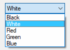
To have one of the items pre-selected when the window first appears, include in Options the word Choose followed immediately by the number of an item to be pre-selected. For example, Choose5 would pre-select the fifth item (as with other options, it can also be a variable such as "Choose" Var). After the control is created, use GuiControl.Value, GuiControl.Text or GuiControl.Choose to change the selection, and GuiControl.Add or GuiControl.Delete to add or remove entries from the list.
Specify either the word Uppercase or Lowercase in Options to automatically convert all items in the list to uppercase or lowercase. Specify the word Sort to automatically sort the contents of the list alphabetically (this also affects any items added later via GuiControl.Add). The Sort option also enables incremental searching whenever the list is dropped down; this allows an item to be selected by typing the first few characters of its name.
GuiControl.Value returns the position number of the currently selected item (the first item is 1, the second is 2, etc.) or 0 if there is no item selected, while GuiControl.Text returns the text of the currently selected item. Gui.Submit stores the text, unless the word AltSubmit is in the control's Options, in which case it stores the position number of the item.
Whenever the user selects a new item, the Change event is raised. The Focus and LoseFocus events are also supported.
Use the R or H option to control the height of the popup list. For example, specifying R5 would make the list 5 rows tall, while H400 would set the total height of the selection field and list to 400 pixels. If both R and H are omitted, the list will automatically expand to take advantage of the available height of the user's desktop.
To set the height of the selection field or list items, use the CB_SETITEMHEIGHT message as in the example below:
MyGui := Gui()
DDL := MyGui.Add("DDL", "vcbx w200 Choose1", ["One", "Two"])
; CB_SETITEMHEIGHT = 0x0153
PostMessage(0x0153, -1, 50, DDL)  ; Set height of selection field.
PostMessage(0x0153, 0, 50, DDL)  ; Set height of list items.
MyGui.Show("h70")
ユーザーが自由にテキストを入力できる領域。
事例:
MyGui.Add("Edit", "r9 vMyEdit w135", "Text to appear inside the edit control (omit this parameter to start off empty).")
Or:
MyGui.AddEdit("r9 vMyEdit w135", "Text to appear inside the edit control (omit this parameter to start off empty).")
アピアランス(外観):
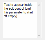
コントロールは、テキストが2行以上ある場合、複数行になります。例えば、Optionsで r3を指定すると、次のようなデフォルトのプロパティを持つ3行エディットコントロールが作成されます:垂直スクロールバー、ワードラッピングを有効にし、Enterはウィンドウのデフォルトボタンをトリガーするのではなく、入力の一部としてキャプチャされます。
複数行の編集コントロールで改行するには、最後のパラメータ(contents)に単独のラインフィード(`n)またはキャリッジリターンとラインフィード(`r`n)を指定します。どちらの方法も、Editコントロールの中にリテラルな`r`nペアを生成します。However, when the control's content is retrieved via Gui.Submit or GuiControl.Value, each `r`n in the text is always translated to a plain linefeed (`n). To bypass this End-of-Line translation, use GuiControl.Text. テキストをファイルに書き出すには、この例に従います:FileAppend(MyEdit.Text, "C:\Saved File.txt")。
コントロールがワードラッピングを有効にしている場合(複数行編集コントロールのデフォルト)、ユーザーが入力する際に発生するラップは、改行文字を生成しません(Enterだけがそれを行うことができます)。
Whenever the user changes the control's content, the Change event is raised.
TIP: To load a text file into an Edit control, use FileRead and GuiControl.Value. 事例:
MyEdit := MyGui.Add("Edit", "R20")
MyEdit.Value := FileRead("C:\My File.txt")
To remove an option rather than adding it, precede it with a minus sign:
Limit: Restricts the user's input to the visible width of the edit field. Alternatively, to limit input to a specific number of characters, include a number immediately afterward. For example, Limit10 would allow no more than 10 characters to be entered.
Lowercase: The characters typed by the user are automatically converted to lowercase.
Multi: Makes it possible to have more than one line of text. However, it is usually not necessary to specify this because it will be auto-detected based on height (H), rows (R), or contents (Text).
Number: Prevents the user from typing anything other than digits into the field (however, it is still possible to paste non-digits into it). An alternate way of forcing a numeric entry is to attach an UpDown control to the Edit.
Password:ユーザーが入力した文字にマスキング文字を代入することで、パスワードを入力するときのようにユーザーの入力を隠します。デフォルト以外のマスキング文字にしたいときは、Passwordの直後に含めてください。例えば、Password*はマスキング文字を黒丸ではなくアスタリスクにします。Note: This option has no effect for multi-line edit controls.
ReadOnly: Prevents the user from changing the control's contents. However, the text can still be scrolled, selected and copied to the clipboard.
Tn: The letter T may be used to set tab stops inside a multi-line edit control (since tab stops determine the column positions to which literal TAB characters will jump, they can be used to format the text into columns). If the letter T is not used, tab stops are set at every 32 dialog units (the width of each "dialog unit" is determined by the operating system). If the letter T is used only once, tab stops are set at every n units across the entire width of the control. For example, MyGui.Add("Edit", "vMyEdit r16 t64") would double the default distance between tab stops. To have custom tab stops, specify the letter T multiple times as in the following example: MyGui.Add("Edit", "vMyEdit r16 t8 t16 t32 t64 t128"). One tab stop is set for each of the absolute column positions in the list, up to a maximum of 50 tab stops. Note: Tab stops require a multiline edit control.
Uppercase: The characters typed by the user are automatically converted to uppercase.
WantCtrlA: Specify -WantCtrlA (minus WantCtrlA) to prevent the user's press of Ctrl+A from selecting all text in the edit control.
WantReturn: Specify -WantReturn (minus WantReturn) to prevent a multi-line edit control from capturing Enter. Pressing Enter will then be the same as pressing the window's default button (if any). In this case, the user may press Ctrl+Enter to start a new line.
WantTab: Causes Tab to produce a tab character rather than navigating to the next control. Without this option, the user may press Ctrl+Tab to produce a tab character inside a multi-line edit control. Note: WantTab also works in a single-line edit control.
Wrap: Specify -Wrap (minus Wrap) to turn off word-wrapping in a multi-line edit control. Since this style cannot be changed after the control has been created, use one of the following to change it: 1) Destroy then recreate the window and its control; or 2) Create two overlapping edit controls, one with wrapping enabled and the other without it. The one not currently in use can be kept empty and/or hidden.
Right、Center、Hiddenなど他のオプションについては、一般的なオプションを参照してください。See also: positioning and sizing of controls.
A more powerful edit control: HiEdit is a free, multitabbed, large-file edit control consuming very little memory. It can edit both text and binary files. For details and a demonstration, see HiEdit on GitHub.
A rectangular border/frame, often used around other controls to indicate they are related. In this case, the last parameter is the title of the box, which if present is displayed at its upper-left edge.
事例:
MyGui.Add("GroupBox", "w200 h100", "Geographic Criteria")
Or:
MyGui.AddGroupBox("w200 h100", "Geographic Criteria")
アピアランス(外観):
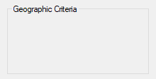
By default, a GroupBox's title may have only one line of text. This can be overridden by specifying Wrap in Options.
To specify the number of rows inside the control (or its height and width), see positioning and sizing of controls.
A box that looks like a single-line edit control but instead accepts a keyboard combination pressed by the user. For example, if the user presses Ctrl+Alt+C on an English keyboard layout, the box would display "Ctrl + Alt + C".
事例:
MyGui.Add("Hotkey", "vChosenHotkey")
Or:
MyGui.AddHotkey("vChosenHotkey")
アピアランス(外観):
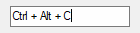
GuiControl.Value returns the control's hotkey modifiers and name, which are compatible with the Hotkey function. Examples: ^!C, +!Home, +^Down, ^Numpad1, !NumpadEnd. If there is no hotkey in the control, the value is blank.
Note: Some keys are displayed the same even though they are retrieved as different names. For example, both ^Numpad7 and ^NumpadHome might be displayed as Ctrl + Num 7.
By default, the control starts off with no hotkey specified. To instead have a default, specify its modifiers and name as the last parameter as in this example: MyGui.Add("Hotkey", "vChosenHotkey", "^!p"). 対応する修飾語は、^(Ctrl)、!(Alt)および +(Shift)のみです。使用可能なキー名については、キーリストを参照してください。
Whenever the user changes the control's content (by pressing a key), the Change event is raised.
Note: The event is raised even when an incomplete hotkey is present. For example, if the user holds down Ctrl, the event is raised once and GuiControl.Value returns only a circumflex (^). When the user completes the hotkey, the event is raised again and GuiControl.Value returns the complete hotkey.
To restrict the types of hotkeys the user may enter, include the word Limit followed by the sum of one or more of the following numbers:
For example, Limit1 would prevent unmodified hotkeys such as letters and numbers from being entered, and Limit15 would require at least two modifier keys. If the user types a forbidden modifier combination, the Ctrl+Alt combination is automatically and visibly substituted.
The Hotkey control has limited capabilities. For example, it does not support mouse/controller hotkeys or Win (LWin and RWin). One way to work around this is to provide one or more checkboxes as a means for the user to enable extra modifiers such as Win.
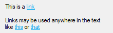
A text control that can contain links similar to those found in a web browser. Within the control's text, enclose the link text within <A> and </A> to create a clickable link. Although this looks like HTML, Link controls only support the opening <A> tag (optionally with an ID and/or HREF attribute) and closing </A> tag.
事例:
MyGui.Add("Link",, 'This is a <a href="https://www.autohotkey.com">link</a>')
MyGui.Add("Link",, 'Links may be used anywhere in the text like <a id="A">this</a> or <a id="B">that</a>')
Or:
MyGui.AddLink(, 'This is a <a href="https://www.autohotkey.com">link</a>')
MyGui.AddLink(, 'Links may be used anywhere in the text like <a id="A">this</a> or <a id="B">that</a>')
アピアランス(外観):
Whenever the user clicks on a link, the Click event is raised. If the control has no Click callback (registered by calling OnEvent), the link's HREF is automatically executed as though passed to the Run function.
MyGui := Gui()
LinkText := 'Click to run <a href="notepad" id="notepad">Notepad</a> or open <a id="help" href="https://www.autohotkey.com/docs/">online help</a>.'
Link := MyGui.Add("Link", "w200", LinkText)
Link.OnEvent("Click", Link_Click)
Link_Click(Ctrl, ID, HREF)
{
    MsgText := Format("
    (
        ID: {1}
        HREF: {2}

        Execute this link?
    )", ID, HREF)
    if MsgBox(MsgText,, "y/n") = "yes"
        Run(HREF)
}
MyGui.Show()
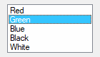
A relatively tall box containing a list of choices that can be selected. In this case, the last parameter of Gui.Add is an Array like ["Choice1", "Choice2", "Choice3"].
事例:
MyGui.Add("ListBox", "r5 vColorChoice", ["Red", "Green", "Blue", "Black", "White"])
Or:
MyGui.AddListBox("r5 vColorChoice", ["Red", "Green", "Blue", "Black", "White"])
アピアランス(外観):
To have one of the items pre-selected when the window first appears, include in Options the word Choose followed immediately by the number of an item to be pre-selected. For example, Choose5 would pre-select the fifth item. To have multiple items pre-selected, use GuiControl.Choose multiple times (requires the Multi option). After the control is created, use GuiControl.Value, GuiControl.Text or GuiControl.Choose to change the selection, and GuiControl.Add or GuiControl.Delete to add or remove entries from the list.
If the Multi option is absent, GuiControl.Value returns the position number of the currently selected item (the first item is 1, the second is 2, etc.) or 0 if there is no item selected, while GuiControl.Text returns the text of the currently selected item. If the Multi option is used, GuiControl.Value and GuiControl.Text return an array of items instead of a single item.
Gui.Submit stores GuiControl.Text, unless the word AltSubmit is in the control's Options, in which case it stores GuiControl.Value.
Whenever the user selects or deselects one or more items, the Change event is raised. The DoubleClick, Focus and LoseFocus events are also supported.
When adding a large number of items to a ListBox, performance may be improved by using MyListBox.Opt("-Redraw") prior to the operation, and MyListBox.Opt("+Redraw") afterward. 詳細は「再描画」を参照。
Choose: See above.
Multi: Allows more than one item to be selected simultaneously via shift-click and control-click (to avoid the need for shift/control-click, specify the number 8 instead of the word Multi). In this case, Gui.Submit or GuiControl.Value returns an array of selected position numbers. For example, [1, 2, 3] would indicate that the first three items are selected. To get an array of selected texts instead, use GuiControl.Text. To extract the individual items from the array, use MyListBox.Text[1] (1 would be the first item) or a For-loop such as this example:
For Index, Field in MyListBox.Text
{
    MsgBox "Selection number " Index " is " Field
}
ReadOnly: Prevents items from being visibly highlighted when they are selected (but Gui.Submit, GuiControl.Value or GuiControl.Text will still return the selected item).
Sort: Automatically sorts the contents of the list alphabetically (this also affects any items added later via GuiControl.Add). The Sort option also enables incremental searching, which allows an item to be selected by typing the first few characters of its name.
Tn: The letter T may be used to set tab stops, which can be used to format the text into columns. If the letter T is not used, tab stops are set at every 32 dialog units (the width of each "dialog unit" is determined by the operating system). If the letter T is used only once, tab stops are set at every n units across the entire width of the control. For example, MyGui.Add("ListBox", "vMyListBox t64") would double the default distance between tab stops. To have custom tab stops, specify the letter T multiple times as in the following example: MyGui.Add("ListBox", "vMyListBox t8 t16 t32 t64 t128"). One tab stop is set for each of the absolute column positions in the list, up to a maximum of 50 tab stops.
0x100: Include 0x100 in Options to turn on the LBS_NOINTEGRALHEIGHT style. This forces the ListBox to be exactly the height specified rather than a height that prevents a partial row from appearing at the bottom. This option also prevents the ListBox from shrinking when its font is changed.
To specify the number of rows of text (or the height and width), see positioning and sizing of controls.
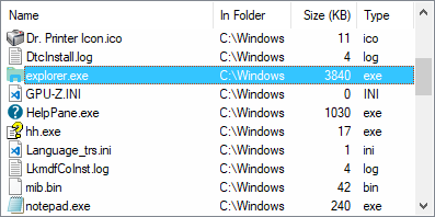
リストビューは、オペレーティングシステムが提供する最も精巧なコントロールの1つです。最も分かりやすい形としては、行と列の表形式で表示され、最も一般的な例としては、エクスプローラーのファイルやフォルダのリスト(詳細表示)があります。
事例:
MyGui.Add("ListView", "r20 w700", ["Name", "In Folder", "Size (KB)", "Type"])
Or:
MyGui.AddListView("r20 w700", ["Name", "In Folder", "Size (KB)", "Type"])
アピアランス(外観):
See the separate ListView page for more information.
A tall and wide control that displays all the days of the month in calendar format. The user may select a single date or a range of dates.
事例:
MyGui.Add("MonthCal", "vMyCalendar")
Or:
MyGui.AddMonthCal("vMyCalendar")
アピアランス(外観):
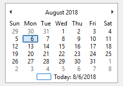
To have a date other than today pre-selected, specify it as the third parameter in YYYYMMDD format (e.g. 20050531). A range of dates may also be pre-selected by including a dash between two dates (e.g. "20050525-20050531").
It is usually best to omit width (W) and height (H) for a MonthCal because it automatically sizes itself to fit exactly one month. To display more than one month vertically, specify R2 or higher in Options. To display more than one month horizontally, specify W-2 (W negative two) or higher. These options may both be present to expand in both directions.
The today-string at the bottom of the control can be clicked to select today's date. In addition, the year and month name are clickable and allow easy selection of a new year or month.
Keyboard navigation: Keyboard navigation is fully supported in MonthCal, but only if it has the keyboard focus. For supported keyboard shortcuts, see DateTime's keyboard navigation (within the drop-down calendar).
When Gui.Submit or GuiControl.Value is used, the return value is the selected date in YYYYMMDD format (without any time portion). However, when the multi-select option is in effect, the minimum and maximum dates are retrieved with a dash between them (e.g. 20050101-20050108). If only a single date was selected in a multi-select calendar, the minimum and maximum are both present but identical. StrSplit can be used to separate the dates. For example, the following would put the minimum in Date[1] and the maximum in Date[2]: Date := StrSplit(MyMonthCal.Value, "-").
Whenever the user changes the selection, the Change event is raised.
When specifying dates in the YYYYMMDD format, the MM and/or DD portions may be omitted, in which case they are assumed to be 1. For example, 200205 is seen as 20020501, and 2005 is seen as 20050101.
Multi: マルチセレクトです。Allows the user to shift-click or click-drag to select a range of adjacent dates (the user may still select a single date too). This option may be specified explicitly or put into effect automatically by means of specifying a selection range when the control is created. For example: MyGui.Add("MonthCal", "vMyCal", "20050101-20050108"). Once the control is created, this option cannot be changed.
Range: Restricts how far back or forward in time the calendar can go. After the word Range, specify the minimum and maximum dates in YYYYMMDD format (with a dash between them). For example, Range20050101-20050615 would restrict the selection to the first 5.5 months of 2005. Either the minimum or maximum may be omitted to leave the calendar unrestricted in that direction. For example, Range20010101 would prevent a date prior to 2001 from being selected and Range-20091231 (leading dash) would prevent a date later than 2009 from being selected. Without the Range option, any date between the years 1601 and 9999 can be selected.
4: Specify the number 4 in Options to display week numbers (1-53) to the left of each row of days. Week numbering is determined by the operating system's user local settings. The three possible modes are described in the documentation for LOCALE_IFIRSTWEEKOFYEAR.
8: Specify the number 8 in Options to prevent the circling of today's date within the control.
16: Specify the number 16 in Options to prevent the display of today's date at the bottom of the control.
Colors: The colors of the day numbers inside the calendar obey that set by Gui.SetFont or the c (Color) option. To change the colors of other parts of the calendar, follow this example:
SendMessage 0x100A, 5, 0xFFAA99, "SysMonthCal321" ; 0x100A is MCM_SETCOLOR. 5 is MCSC_TITLETEXT (color of title text). The color must be specified in BGR vs. RGB format (red and blue components swapped).
An area containing an image (see last two paragraphs for supported file types). The last parameter is the filename of the image, which is assumed to be in A_WorkingDir if an absolute path isn't specified.
事例:
MyGui.Add("Picture", "w300 h-1", "C:\My Pictures\Company Logo.gif")
Or:
MyGui.AddPicture("w300 h-1", "C:\My Pictures\Company Logo.gif")
To retain the image's actual width and/or height, omit the W and/or H options. Otherwise, the image is scaled to the specified width and/or height (this width and height also determines which icon to load from a multi-icon .ICO file). 画像のアスペクト比を保ったまま縮小・拡大する場合は、一方の寸法に-1、他方の寸法に正の数を指定します。例えば、"w200 h-1"を指定すると、画像の幅は200ピクセルになり、高さは自動的に設定されました。If the picture cannot be loaded or displayed (e.g. file not found), an error is thrown and the control is not added.
Picture controls support the Click and DoubleClick events, with the same caveat as Text controls.
To use a picture as a background for other controls, the picture should normally be added prior to those controls. However, if those controls are input-capable and the picture has the SS_NOTIFY style (which may be added automatically by OnEvent), create the picture after the other controls and include 0x4000000 (which is WS_CLIPSIBLINGS) in the picture's Options. This trick also allows a picture to be the background behind a Tab control or ListView.
Icons, cursors, and animated cursors: Icons and cursors may be loaded from the following types of files: ICO, CUR, ANI, EXE, DLL, CPL, SCR, and other types that contain icon resources. To use an icon group other than the first one in the file, include in Options the word Icon followed by the number of the group. 次の例では、2番目のアイコングループのデフォルトアイコンが使用されることになります:MyGui.Add("Picture", "Icon2", "C:\My Application.exe")。
Specifying the word AltSubmit in Options tells the program to use Microsoft's GDIPlus.dll to load the image, which might result in a different appearance for GIF, BMP, and icon images. For example, it would load a GIF that has a transparent background as a transparent bitmap, which allows the BackgroundTrans option to take effect (but icons support transparency without AltSubmit).
Formats supported without the use of GDIPlus include GIF, JPG, BMP, ICO, CUR, and ANI images. GDIPlus is used by default for other image formats, such as PNG, TIF, Exif, WMF and EMF.
Animated GIFs: Although animated GIF files can be displayed in a picture control, they will not actually be animated. To solve this, use the AniGIF DLL (which is free for non-commercial use) as demonstrated at the AutoHotkey Forums. Alternatively, the ActiveX control type can be used. 事例:
; Specify below the path to the GIF file to animate (local files are allowed too):
pic := "http://www.animatedgif.net/cartoons/A_5odie_e0.gif"
MyGui := Gui()
MyGui.Add("ActiveX", "w100 h150", "mshtml:<img src='" pic "' />")
MyGui.Show()
ファイル名の代わりにビットマップやアイコンハンドルを使うこともできる。例えば、"HBITMAP:" handle。
A dual-color bar typically used to indicate how much progress has been made toward the completion of an operation.
事例:
MyGui.Add("Progress", "w200 h20 cBlue vMyProgress", 75)
Or:
MyGui.AddProgress("w200 h20 cBlue vMyProgress", 75)
アピアランス(外観):
Specify the starting position of the bar as the third parameter (if omitted, the bar starts off at 0 or the number in the allowable range that is closest to 0). To later change the position of the bar, follow these examples, all of which operate upon a progress bar whose Name is MyProgress:
MyGui["MyProgress"].Value += 20  ; Increase the current position by 20.
MyGui["MyProgress"].Value := 50  ; Set the current position to 50.
For horizontal Progress Bars, the thickness of the bar is equal to the control's height. For vertical Progress Bars it is equal to the control's width.
Cn: Changes the bar's color. Specify for n one of the 16 primary HTML color names or a 6-digit RGB color value. Examples: cRed, cFFFF33, cDefault. If the C option is never used (or cDefault is specified), the system's default bar color will be used.
BackgroundN: Changes the bar's background color. Specify for N one of the 16 primary HTML color names or a 6-digit RGB color value. Examples: BackgroundGreen, BackgroundFFFF33, BackgroundDefault. If the Background option is never used (or BackgroundDefault is specified), the background color will be that of the window or tab control behind it.
Range: Sets the range to be something other than 0 to 100. After the word Range, specify the minimum, a dash, and maximum. For example, Range0-1000 would allow numbers between 0 and 1000; Range-50-50 would allow numbers between -50 and 50; and Range-10--5 would allow numbers between -10 and -5.
Smooth: Displays a simple continuous bar. If this option is not used and the bar does not have any custom colors, the bar's appearance is defined by the current system theme. Otherwise, the bar appears as a length of segments.
Vertical: Makes the bar rise or fall vertically rather than move along horizontally.
The above options can be changed via GuiControl.Opt after the control is created.
A radio button is a small empty circle that can be checked (on) or unchecked (off).
事例:
MyGui.Add("Radio", "vMyRadioGroup", "Wait for all items to be in stock before shipping.")
Or:
MyGui.AddRadio("vMyRadioGroup", "Wait for all items to be in stock before shipping.")
アピアランス(外観):

These controls usually appear in radio groups, each of which contains two or more radio buttons. When the user clicks a radio button to turn it on, any others in its radio group are turned off automatically (the user may also navigate inside a group with the arrow keys). A radio group is created automatically around all consecutively added radio buttons. To start a new group, specify the word Group in the Options of the first button of the new group -- or simply add a non-radio control in between, since that automatically starts a new group.
For the last parameter, specify the label to display to the right of the radio button. This label is typically used as a prompt or description, and it may include linefeeds (`n) to start new lines. If a width (W) is specified in Options but no rows (R) or height (H), the control's text will be word-wrapped as needed, and the control's height will be set automatically.
Specify the word Checked in Options to have the button start off in the "on" state. The word Checked may optionally be followed immediately by a 0 or 1 to indicate the starting state: 0 for unchecked and 1 for checked. In other words, "Checked" and "Checked" VarContainingOne are the same.
GuiControl.Value returns the number 1 for "on" and 0 for "off". To instead retrieve the position number of the selected radio option within a radio group, name only one of the radio buttons and use Gui.Submit.
Whenever the user turns on the button, the Click event is raised. Unlike the single-variable mode in the previous paragraph, the event callback must be registered for each button in a radio group for which it should be called. This allows the flexibility to ignore the clicks of certain buttons.
The DoubleClick, Focus and LoseFocus events are also supported. As these events are only raised if the control has the BS_NOTIFY (0x4000) style, it is added automatically by OnEvent.
Known limitation: Certain desktop themes might not display a radio button's text properly. If this occurs, try including -Wrap (minus Wrap) in the control's options. However, this also prevents having more than one line of text.
A sliding bar that the user can move along a vertical or horizontal track. The standard volume control in the taskbar's tray is an example of a slider.
事例:
MyGui.Add("Slider", "vMySlider", 50)
Or:
MyGui.AddSlider("vMySlider", 50)
アピアランス(外観):
Specify the starting position of the slider as the last parameter. If the last parameter is omitted, the slider starts off at 0 or the number in the allowable range that is closest to 0.
The user may slide the control by the following means: 1) dragging the bar with the mouse; 2) clicking inside the bar's track area with the mouse; 3) turning the mouse wheel while the control has focus; or 4) pressing the following keys while the control has focus: ↑, →, ↓, ←, PgUp, PgDn, Home, and End.
GuiControl.Value and Gui.Submit return or store the current numeric position of the slider.
By default, the slider's Change event is raised when the user has stopped moving the slider, such as by releasing the mouse button after having dragging it. If the control has the AltSubmit option, the Change event is also raised (very frequently) after each visible movement of the bar while the user is dragging it with the mouse.
Ctrl_Change(GuiCtrlObj, Info)
Type: Integer
A numeric value from the tables below indicating how the slider was moved. These values and the corresponding names are defined in the Windows SDK.
| 値 | 名前 | 意味 |
|---|---|---|
| 0 | TB_LINEUP | The user pressed ← or ↑. |
| 1 | TB_LINEDOWN | The user pressed → or ↓. |
| 2 | TB_PAGEUP | The user pressed PgUp. |
| 3 | TB_PAGEDOWN | The user pressed PgDn. |
| 4 | TB_THUMBPOSITION | The user moved the slider via the mouse wheel, or finished a drag-and-drop to a new position. |
| 6 | TB_TOP | The user pressed Home to send the slider to the left or top side. |
| 7 | TB_BOTTOM | The user pressed End to send the slider to the right or bottom side. |
Only if the AltSubmit option is used:
| 値 | 名前 | 意味 |
|---|---|---|
| 5 | TB_THUMBTRACK | The user is currently dragging the slider via the mouse; that is, the mouse button is currently down. |
| 8 | TB_ENDTRACK | The user has finished moving the slider, either via the mouse or the keyboard. Note: With the exception of mouse wheel movement (#4), the Change event is raised again for #8 even though it was already raised with one of the digits above. |
Buddy1 and Buddy2: Specifies up to two existing controls to automatically reposition at the ends of the slider. Buddy1 is displayed at the left or top side (depending on whether the Vertical option is present). Buddy2 is displayed at the right or bottom side. After the word Buddy1 or Buddy2, specify the Name or HWND of an existing control. For example, Buddy1MyTopText would assign the control whose name is MyTopText. The text or ClassNN of a control can also be used, but only up to the first space or tab.
Center: The thumb (the bar moved by the user) will be blunt on both ends rather than pointed at one end.
Invert: Reverses the control so that the lower value is considered to be on the right/bottom rather than the left/top. This is typically used to make a vertical slider move in the direction of a traditional volume control. Note: The ToolTip option described below will not obey the inversion and therefore should not be used in this case.
Left: The thumb (the bar moved by the user) will point to the top rather than the bottom. But if the Vertical option is in effect, the thumb will point to the left rather than the right.
Line: Specifies the number of positions to move when the user presses one of the arrow keys. After the word Line, specify number of positions to move. For example: Line2.
NoTicks: Omits tickmarks alongside the track.
Page: Specifies the number of positions to move when the user presses PgUp or PgDn. After the word Page, specify number of positions to move. For example: Page10.
Range: Sets the range to be something other than 0 to 100. After the word Range, specify the minimum, a dash, and maximum. For example, Range1-1000 would allow a number between 1 and 1000 to be selected; Range-50-50 would allow a number between -50 and 50; and Range-10--5 would allow a number between -10 and -5.
Thick: Specifies the length of the thumb (the bar moved by the user). After the word Thick, specify the thickness in pixels (e.g. Thick30). To go beyond a certain thickness, it is probably necessary to either specify the Center option or remove the theme from the control (which can be done by specifying -Theme in the control's options).
TickInterval: Provides tickmarks alongside the track at the specified interval. After the word TickInterval, specify the interval at which to display additional tickmarks (if the interval is never set, it defaults to 1). For example, TickInterval10 would display a tickmark once every 10 positions.
ToolTip: Creates a tooltip that reports the numeric position of the slider as the user is dragging it. To have the tooltip appear in a non-default position, specify one of the following instead: ToolTipLeft or ToolTipRight (for vertical sliders); ToolTipTop or ToolTipBottom (for horizontal sliders).
Vertical: Makes the control slide up and down rather than left and right.
The above options can be changed via GuiControl.Opt after the control is created.
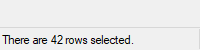
A row of text and/or icons attached to the bottom of a window, which is typically used to report changing conditions.
事例:
SB := MyGui.Add("StatusBar",, "Bar's starting text (omit to start off empty).")
SB.SetText("There are " . RowCount . " rows selected.")
Or:
SB := MyGui.AddStatusBar(, "Bar's starting text (omit to start off empty).")
SB.SetText("There are " . RowCount . " rows selected.")
アピアランス(外観):
The simplest use of a status bar is to call the SetText method whenever something changes that should be reported to the user. To report more than one piece of information, divide the bar into sections via the SetParts method. To display icon(s) in the bar, call the SetIcon method.
Displays NewText in the specified part of the status bar.
GuiCtrl.SetText(NewText , PartNumber, Style)
型:文字列
Up to two tab characters (`t) may be present anywhere in NewText: anything to the right of the first tab is centered within the part, and anything to the right of the second tab is right-justified.
Type: Integer
省略したときは、初期値は 1 です。Otherwise, specify an integer between 1 and 256.
Type: Integer
If omitted, it defaults to 0, which uses a traditional border that makes that part of the bar look sunken. Otherwise, specify 1 to have no border or 2 to have border that makes that part of the bar look raised.
Divides the bar into multiple sections according to the specified widths (in pixels).
GuiCtrl.SetParts(Width1, Width2, ... Width255)
Type: Integer
If all parameters are omitted, the bar is restored to having only a single, long part. Otherwise, specify the width of each part except the last (the last will fill the remaining width of the bar). For example, SB.SetParts(50, 50) would create three parts: the first two of width 50 and the last one of all the remaining width.
Type: Integer
This method returns the status bar's window handle (HWND). コントロールのHWNDは、PostMessage、SendMessage、DllCallでよく使用されます。また、Controlパラメータで使用します。
Any parts "deleted" by this method will start off with no text the next time they are shown (furthermore, their icons are automatically destroyed).
Displays a small icon to the left of the text in the specified part.
GuiCtrl.SetIcon(FileName , IconNumber, PartNumber)
型:文字列
The path to an icon or image file, or a bitmap or icon handle such as "HICON:" handle. 対応フォーマットの一覧は、ピクチャーコントロールをご覧ください。
Type: Integer
If omitted, it defaults to 1 (the first icon group). Otherwise, specify the number of the icon group to be used in the file. For example, SB.SetIcon("Shell32.dll", 2) would use the default icon from the second icon group. If negative, its absolute value is assumed to be the resource ID of an icon within an executable file.
Type: Integer
省略したときは、初期値は 1 です。Otherwise, specify an integer between 1 and 256.
Type: Integer
This method returns the icon's handle (HICON). The HICON is a system resource that can be safely ignored by most scripts because it is destroyed automatically when the status bar's window is destroyed. Similarly, any old icon is destroyed when this method replaces it with a new one. This can be avoided via:
SendMessage(0x040F, PartNumber - 1, HICON, SB) ; 0x040F is SB_SETICON.
Reacting to mouse clicks: Whenever the user clicks on the bar, the Click, DoubleClick or ContextMenu event is raised, and the Info or Item parameter contains the part number. ただし、バー右側のサイズグリップ付近をクリックした場合、品番は非常に大きな整数になる可能性があります。
Font and color: Although the font size, face, and style can be set via Gui.SetFont (just like normal controls), the text color cannot be changed. The status bar's background color may be changed by specifying in Options the word Background followed immediately by a color name (see color chart) or RGB value (the 0x prefix is optional). Examples: BackgroundSilver, BackgroundFFDD99, BackgroundDefault. Note that the control must have Classic Theme appearance. Thus, the -Theme option must be specified along with the Background option, e.g. -Theme BackgroundSilver.
Hiding the StatusBar: Upon creation, the bar can be hidden via SB := MyGui.Add("StatusBar", "Hidden"). To hide it sometime after creation, use SB.Visible := false. To show it, use SB.Visible := true. Note: Hiding the bar does not reduce the height of the window. If that is desired, one easy way is MyGui.Show("AutoSize").
Styles (rarely used): See the StatusBar styles table.
Known limitations: 1) Any control that overlaps the status bar might sometimes get drawn on top of it. One way to avoid this is to dynamically shrink such controls via Size event. 2) Positioning and sizing options are ignored. 3) There is a limit of one status bar per window.
Example: Example #1 at the bottom of the TreeView page demonstrates a multipart status bar.
A large control containing multiple pages, each of which contains other controls. From this point forward, these pages are referred to as "tabs".
There are three types of Tab control:
事例:
MyGui.Add("Tab3",, ["General", "View", "Settings"])
Or:
MyGui.AddTab3(, ["General", "View", "Settings"])
アピアランス(外観):
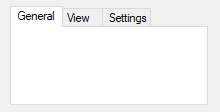
The last parameter above is an Array of tab names. After creating a Tab control, subsequently added controls automatically belong to its first tab. To change this, use the UseTab method below. For details and an example, see Tab Usage.
Specifies the tab to which subsequently created controls will be added.
GuiCtrl.UseTab(Value, ExactMatch)
If blank or omitted, it defaults to 0, which causes subsequently created controls to be added outside the Tab control. Otherwise, specify 1 for the first tab, 2 for the second, etc.
If Value is a string (even a numeric string), the tab whose leading name part matches Value will be used. 検索では、大文字と小文字は区別されません。例えば、あるコントロールに「UNIX Text」というタブがある場合、unix(小文字)という単語を指定すれば、それを使用することができます。Use ExactMatch to change this matching behavior.
型:論理値
省略されたときは、デフォルトはfalseです。
If false, the tab whose leading name part matches Value will be used, as described above.
If true, Value has to be an exact match (but still not case-sensitive).
To have one of the tabs pre-selected when the window first appears, include in Options the word Choose followed immediately by the number of a tab to be pre-selected. For example, Choose5 would pre-select the fifth tab (as with other options, it can also be a variable such as "Choose" Var). After the control is created, use GuiControl.Value, GuiControl.Text or GuiControl.Choose to change the selected tab, and GuiControl.Add or GuiControl.Delete to add or remove tabs.
After creating a Tab control, subsequently added controls automatically belong to its first tab. This can be changed at any time by using the UseTab method as follows (in this case, Tab is the GuiControl object of the first tab control and Tab2 of the second one):
Tab.UseTab()  ; Future controls are not part of any tab control.
Tab.UseTab(3)  ; Future controls are owned by the third tab of the current tab control.
Tab2.UseTab(3)  ; Future controls are owned by the third tab of the second tab control.
Tab.UseTab("Name")  ; Future controls are owned by the tab whose name starts with Name (not case-sensitive).
Tab.UseTab("Name", true)  ; Same as above but requires exact match (not case-sensitive).
It is also possible to use any of the examples above to assign controls to a tab or tab-control that does not yet exist (except in the case of the Name method). But in that case, the relative positioning options described below are not supported.
Positioning: When each tab of a Tab control receives its first sub-control, that sub-control will have a special default position under the following conditions: 1) The X and Y coordinates are both omitted, in which case the first sub-control is positioned at the upper-left corner of the tab control's interior (with a standard margin), and sub-controls beyond the first are positioned beneath the previous control; 2) The X+n and/or Y+n positioning options are specified, in which case the sub-control is positioned relative to the upper-left corner of the tab control's interior. For example, specifying x+10 y+10 would position the control 10 pixels right and 10 pixels down from the upper left corner.
Current tab: GuiControl.Value returns the position number of the currently selected tab (the first tab is 1, the second is 2, etc.), while GuiControl.Text returns the text of the currently selected tab. Gui.Submit stores the text, unless the word AltSubmit is in the control's Options, in which case it stores the position number of the tab.
Detecting tab selection: Whenever the user switches tabs, the Change event is raised.
Keyboard navigation: The user may press Ctrl+PgDn/PgUp to navigate from page to page in a tab control; if the keyboard focus is on a control that does not belong to a Tab control, the window's first Tab control will be navigated. Ctrl+Tab and Ctrl+Shift+Tab may also be used except that they will not work if the currently focused control is a multi-line Edit control.
Limits: Each window may have no more than 255 tab controls. Each tab control may have no more than 256 tabs (pages). In addition, a tab control may not contain other tab controls.
Parent window: The parent window of a control affects the positioning and visibility of the control and tab-key navigation order. If a sub-control is added to an existing Tab3 control, its parent window is the "tab dialog", which fills the tab control's display area. Most other controls, including sub-controls of Tab or Tab2 controls, have no parent other than the GUI window itself.
Positioning: For Tab and Tab2, sub-controls do not necessarily need to exist within their tab control's boundaries: they will still be hidden and shown whenever their tab is selected or de-selected. This behavior is especially appropriate for the "buttons" style described below.
For Tab3, sub-controls assigned to a tab before the tab control is created behave as though added to a Tab or Tab2 control. All other sub-controls are visible only within the display area of the tab control.
If a Tab3 control is moved, its sub-controls are moved with it. Tab and Tab2 controls do not have this behavior.
In the rare case that WinMove (or an equivalent DllCall) is used to move a control, the coordinates must be relative to the parent window of the control, which might not be the GUI (see above). By contrast, GuiControl.Move takes GUI coordinates and ControlMove takes window coordinates, regardless of the control's parent window.
Autosizing: If not specified by the script, the width and/or height of the Tab3 control are automatically calculated at one of the following times (whichever comes first after the control is created):
The calculated size accounts for sub-controls which exist when autosizing occurs, plus the default margins. The size is calculated only once, and will not be recalculated even if controls are added later. If the Tab3 control is empty, it receives the same default size as a Tab or Tab2 control.
Tab and Tab2 controls are not autosized; they receive an arbitrary default size.
Tab-key navigation order: The navigation order via Tab usually depends on the order in which the controls are created. When tab controls are used, the order also depends on the type of tab control:
Notification messages (Tab3): Common and Custom controls typically send notification messages to their parent window. Any WM_COMMAND, WM_NOTIFY, WM_VSCROLL, WM_HSCROLL or WM_CTLCOLOR' messages received by a Tab3 control's tab dialog are forwarded to the GUI window and can be detected by using OnMessage. If the tab control is themed and the sub-control lacks the +BackgroundTrans option, WM_CTLCOLORSTATIC is fully handled by the tab dialog and not forwarded. Other notification messages (such as custom messages) are not supported.
Known issues with Tab2:
Known issues with Tab:
Choose: See above.
Background: Specify -Background (minus Background) to override the window's custom background color and use the system's default Tab control color. Specify +Theme -Background to make the Tab control conform to the current desktop theme. However, most control types will look strange inside such a Tab control because their backgrounds will not match that of the tab control. This can be fixed for some control types (such as Text) by adding BackgroundTrans to their options.
Buttons: Creates a series of buttons at the top of the control rather than a series of tabs (in this case, there will be no border by default because the display area does not typically contain controls).
Left/Right/Bottom: Specify one of these words to have the tabs on the left, right, or bottom side instead of the top. See TCS_VERTICAL for limitations on Left and Right.
Wrap: Specify -Wrap (minus Wrap) to prevent the tabs from taking up more than a single row (in which case if there are too many tabs to fit, arrow buttons are displayed to allow the user to slide more tabs into view).
To specify the number of rows of text inside the control (or its height and width), see positioning and sizing of controls.
Icons in Tabs: An icon may be displayed next to each tab's name/text via SendMessage. This is demonstrated in the archived forum topic Icons in tabs.
ユーザーが編集できない、境界のないテキストを含む領域。他のコントロールのラベルに使用されることが多い。
事例:
MyGui.Add("Text",, "Please enter your name:")
Or:
MyGui.AddText(, "Please enter your name:")
アピアランス(外観):
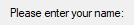
この場合、最後のパラメータは表示する文字列となります。新しい行を開始するための改行(`n)を含むことができる。また、1本の長い線を、継続部によっていくつかの短い線に分割することができます。
If a width (W) is specified in Options but no rows (R) or height (H), the control's text will be word-wrapped as needed, and the control's height will be set automatically.
ユーザーがテキストをクリックしたことを検出するには、Click イベントを使用します。事例:
MyGui := Gui()
FakeLink := MyGui.Add("Text", "", "Click here to launch Google.")
FakeLink.SetFont("underline cBlue")
FakeLink.OnEvent("Click", LaunchGoogle)

; また、Linkコントロールも使用することができます:
MyGui.Add("Link",, 'Click <a href="www.google.com">here</a> to launch Google.')
MyGui.Show()

LaunchGoogle(*) {
    Run("www.google.com")
}
テキストコントロールはDoubleClickイベントにも対応しています。
SS_NOTIFY(0x100)スタイルを持つTextコントロールだけがクリックやダブルクリックの通知を送るので、OnEventはClickやDoubleClickコールバックが登録されると自動的にこのスタイルを追加します。SS_NOTIFYスタイルは、コントロールがダブルクリックされたときに、OSが自動的にコントロールのテキストをクリップボードにコピーするようにします。
本文中でアンパサンド(&)を使用し、1文字に下線を引くことができる。事例:
MyGui.Add("Text",, "&First Name:")
MyGui.Add("Edit")
上の例では、Fという文字に下線が引かれ、ユーザーはショートカットキー Alt+Fを押すことで、テキストコントロールの後に追加された最初の入力可能なコントロールにキーボードフォーカスを設定することができるようになります。アンパサンドを表示させる場合は、アンパサンド(&&)を2つ連続して指定します。アンパサンドに対する特別な処理をすべて無効にするには、コントロールのオプションに0x80を含めます。
Right、Center、Hiddenなど他のオプションについては、一般的なオプションを参照してください。See also: positioning and sizing of controls.
A TreeView displays a hierarchy of items by indenting child items beneath their parents. 最も一般的な例は、エクスプローラーのドライブとフォルダーのツリーである。
事例:
MyGui.Add("TreeView", "r10")
Or:
MyGui.AddTreeView("r10")
アピアランス(外観):
See the separate TreeView page for more information.
A pair of arrow buttons that the user can click to increase or decrease a value. By default, an UpDown control automatically snaps onto the previously added control. This previous control is known as the UpDown's buddy control. The most common example is a "spinner", which is an UpDown attached to an Edit control.
事例:
MyGui.Add("Edit")
MyGui.Add("UpDown", "vMyUpDown Range1-10", 5)
Or:
MyGui.AddEdit()
MyGui.AddUpDown("vMyUpDown Range1-10", 5)
アピアランス(外観):
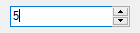
In the example above, the Edit control is the UpDown's buddy control. Whenever the user presses one of the arrow buttons, the number in the Edit control is automatically increased or decreased.
An UpDown's buddy control can also be a Text control or ListBox. However, due to OS limitations, controls other than these (such as ComboBox and DropDownList) might not work properly with the Change event and other features.
Specify the UpDown's starting position as the last parameter (if omitted, it starts off at 0 or the number in the allowable range that is closest to 0).
When Gui.Submit or GuiControl.Value is used, the return value is the current numeric position of the UpDown. If the UpDown is attached to an Edit control and you do not wish to validate the user's input, it is best to use the UpDown's value rather than the Edit's. This is because the UpDown will always yield an in-range number, even when the user has typed something non-numeric or out-of-range in the Edit control. On a related note, numbers with more than three digits get a thousands separator (such as comma) by default. These separators are returned by the Edit control but not by the UpDown control.
Whenever the user clicks one of the arrow buttons or presses an arrow key on the keyboard, the Change event is raised.
Horz: Makes the control's buttons point left/right rather than up/down. By default, Horz also makes the control isolated (no buddy). This can be overridden by specifying Horz 16 in the control's options.
Left: Puts the UpDown on the left side of its buddy rather than the right.
Range: Sets the range to be something other than 0 to 100. After the word Range, specify the minimum, a dash, and maximum. For example, Range1-1000 would allow a number between 1 and 1000 to be selected; Range-50-50 would allow a number between -50 and 50; and Range-10--5 would allow a number between -10 and -5. The minimum and maximum may be swapped to cause the arrows to move in the opposite of their normal direction. The broadest allowable range is -2147483648-2147483647. Finally, if the buddy control is a ListBox, the range defaults to 32767-0 for verticals and the inverse for horizontals (Horz).
Wrap:ユーザーが最小値または最大値を超えようとしたときに、コントロールがその範囲のもう一方の端に回り込むようにする。Wrapなしでは、コントロールは最小または最大に達すると停止する。
16: Specify -16 (minus 16) to cause a vertical UpDown to be isolated; that is, it will have no buddy. This also causes the control to obey any specified width, height, and position rather than conforming to the size of its buddy control. In addition, an isolated UpDown tracks its own position internally. This position can be retrieved normally by means such as Gui.Submit or GuiControl.Value.
0x80: Include 0x80 in Options to omit the thousands separator that is normally present between every three decimal digits in the buddy control. However, this style is normally not used because the separators are omitted from the number whenever the script retrieves it from the UpDown control itself (rather than its buddy control).
Increments other than 1: This script demonstrates how to change an UpDown's increment to a value other than 1 (such as 5 or 0.1).
Hexadecimal number format: The number format displayed inside the buddy control may be changed from decimal to hexadecimal by following this example:
SendMessage 0x046D, 16, 0, "msctls_updown321" ; 0x046D is UDM_SETBASE
However, this affects only the buddy control, not the UpDown's reported position.
See also: positioning and sizing of controls.
ListView、TreeView、Gui()、Guiオブジェクト、GuiControlオブジェクト、Menuオブジェクト